The Art of Finding Nemo is a golden oldie in terms of concept art books and to me, it has an extra special significance.
The film and the concept art book mark the turning point in my career, where I turned away from traditionally academia to follow an artistic career path.
In this post, I look to review The Art of Finding Nemo and showcase some of the exquisite art from it. I also let you in on a very personal moment and how this book and film changed the trajectory of my life.
Let's dive in.
Contents
A little nostalgia
It was 2003 and I'd just been to see the latest Pixar blockbuster, Finding Nemo. I remember coming out of the cinema, transfixed.
The incredible animation, breath-taking visuals and heart-warming story mesmerised me. More than that, however, they reignited an innate desire - a yearning, more like - to create my own worlds and characters and stories, just like those on the big screen.
I'd always felt these urges, but I think years of relentless academia had suffocated them.
But watching Finding Nemo was like an adrenaline shot to the heart.
These innate urges were suddenly revived and burning with intense ferocity, incinerating any attempts by logic or reason to dampen the flames. All appeals to follow a 'sensible' career were subsequently ignored. From that moment, I collected as many books as I could, including this one; I was compelled to pursue a career in animation.
And so, 17 years later, with many years in the animation industry under my belt, it's with a fond smile that I'm flicking through the well-worn pages of this book, writing this review. It truly changed the trajectory of my life.
Anyway, nostalgia to one side, let's shine the spotlight on the star of the show: The Art of Finding Nemo.
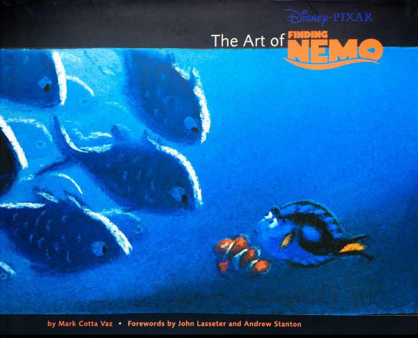
The Art of Finding Nemo: Overview
At 160 pages, The Art of Finding Nemo doesn't take long to read, but the beautiful artwork will keep you captivated for hours.
The artwork is arranged into 3 major chapters, each matching chronologically the 3 major sections of the film. These are entitled 'Leaving Home', 'The Big Blue' and 'The Tank and Harbour'.
If you haven't seen the film here's a spoiler-free summary:
Nemo is an adventurous clownfish who gets fish-napped! Driven both to prove his courage to his friends and to defy his overprotective father, Nemo travels too far from the safety of their coral reef and ends up being captured. He's transported back to Sydney and plopped in the tank of a dentist's office exotic fish tank. Consequently, Marlin, Nemo's fretful Father, must overcome his fears and traverse the dangers of the open ocean on a 5-day daring mission to rescue his son.
It was the fifth and most successful Pixar film to date (before it was surpassed in 2010 by Toy Story 3). For 2003, the visuals were spectacular but watching it again in 2020 and the CGI looks understandably dated.
However, not so the concept art!
Filled with sensational lighting studies, amazing character sketches and insightful storyboards, the concept art featured in The Art of Finding Nemo remains exquisitely timeless.
Perhaps that's why I love concept art so much; you can look back at sketches of Sleeping Beauty or Snow White and the Seven Dwarves - heck you could go back even further to look at the preparatory sketches of Da Vinci and Michelangelo - and no matter how old, they're all filled with a timeless vitality.
Below is a closer look at the concept art from each of the 3 chapters.
Chapter 1: Leaving Home
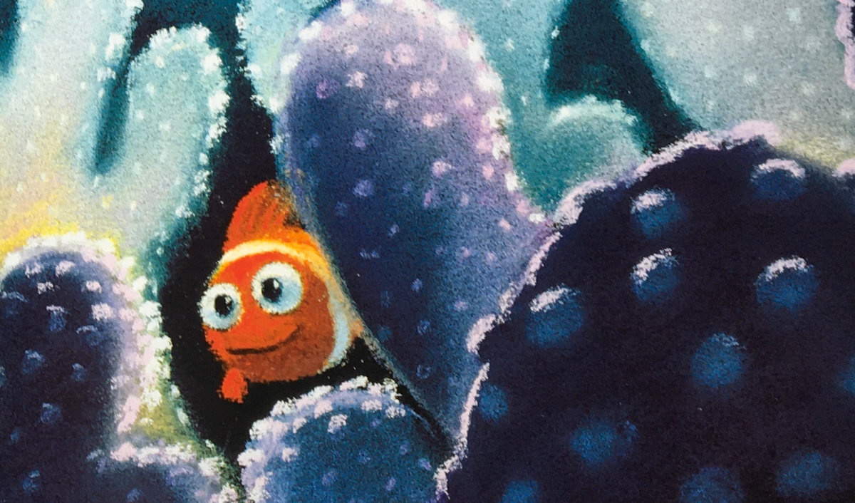
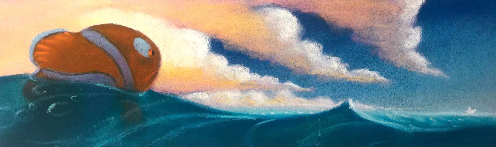
Nemo's home is the beautiful coral environment of the Great Barrier Reef. As such, the vibrant colours of the coral reef are vividly brought to life with exquisite pastel concepts
Production designer Ralph Eggleston is credited with much of the pastel work in this book. It's such a vibrant yet messy medium, but he handles it with masterful skill, producing gorgeous lighting studies and colour storyboards.

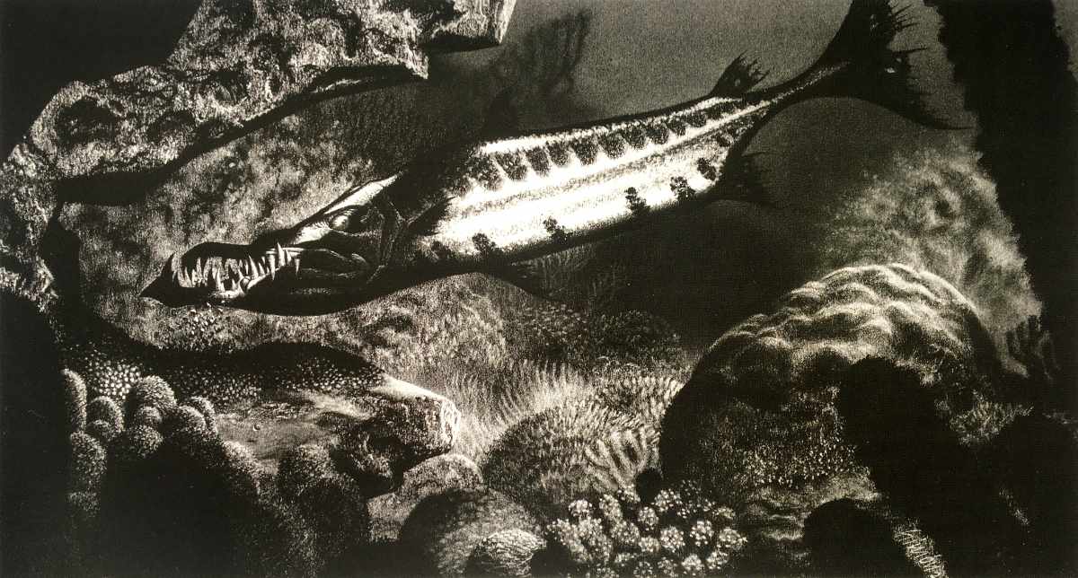
The other stand out artist featured heavily in this book is Simón Varela. His black and white charcoal concepts are amazing and so detailed.
They remind me of the black and white drawings of M. C. Escher. I like that these often feature as full or even double-page spreads as it allows you to pour over them and revel in the details.
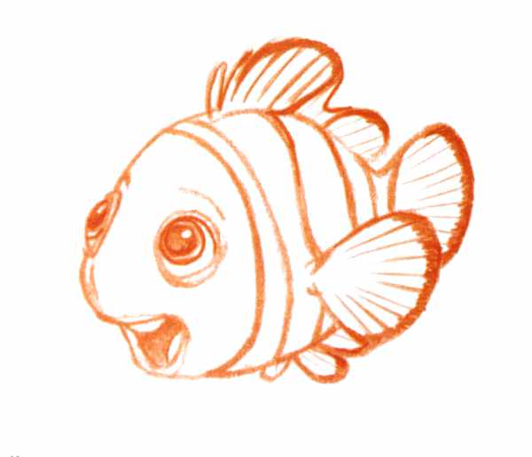
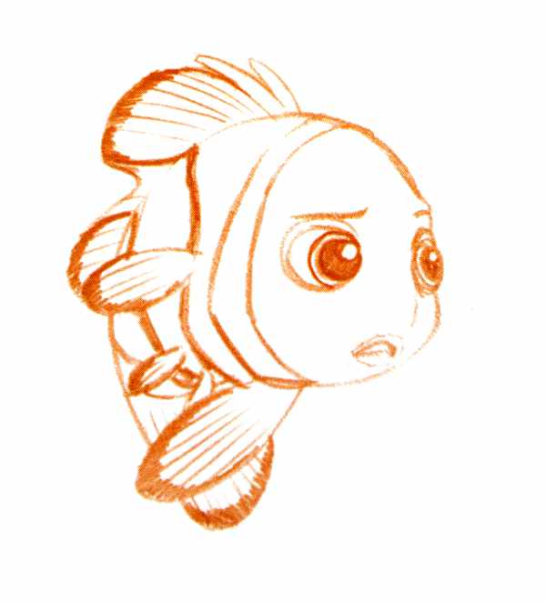
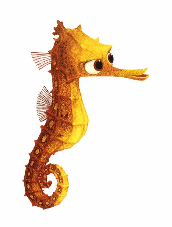
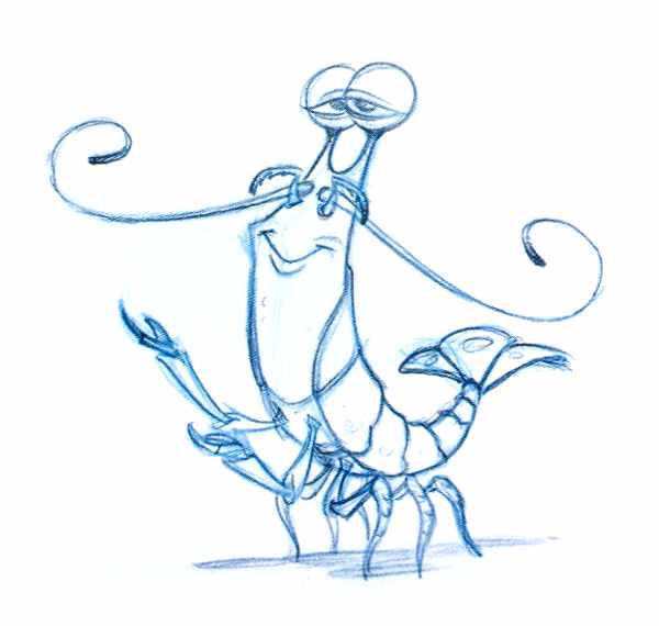
I would say pencil character design sketches are my favourite type of concept art. And whilst the first chapter seems predominantly filled with pastel lighting studies, there are a few character designs too.
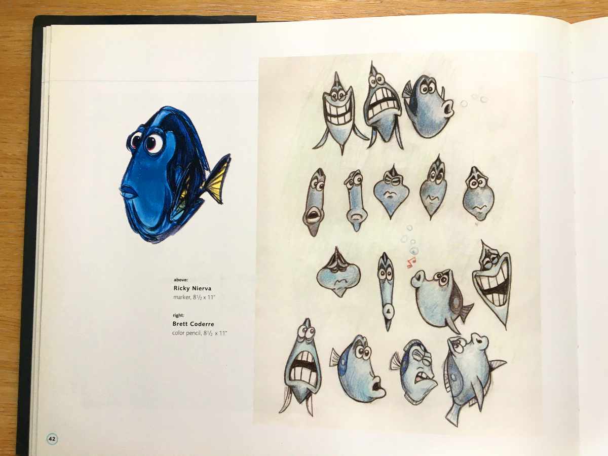
I especially like the Nemo character designs on page 26 and the cartoony sketches of Dory's expressions on page 42.
If like me character design is more your thing, chapter 3 is where you'll find most of the character design sketches in this book.
Chapter 2: The Big Blue
In the film, the gang of fish in the dentist's office refers to the open ocean as 'The Big Blue'. However, in terms of narrative, 'The Big Blue' is also the part of the story that represents the journey into the unknown.
In Finding Nemo, after leaving the safety of home, this is where Marlin encounters many dangers and challenges such as bloodthirsty sharks, submerged minefields, poisonous jellyfish and electric anglerfish.
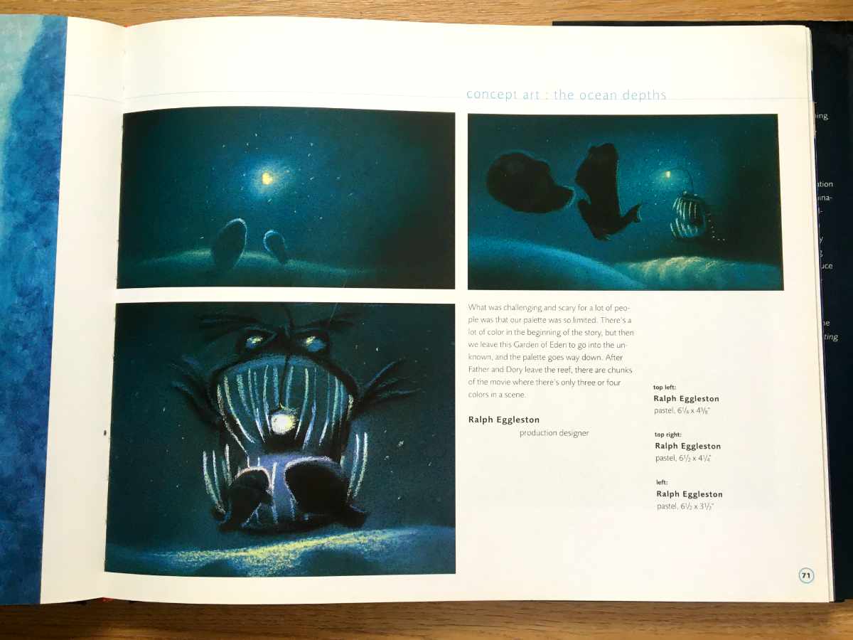
The artwork in this section, therefore, is full of murky greens and hypnotic pinks. As Ralph Eggleston highlights:
"There's a lot of colour at the beginning of the story, but then we leave this Garden of Eden to go into the unknown, the palette goes way down. After Father and Dory leave the reef, there are chunks of the movie where there are only three or four colours in a scene."
Again, the pastels dominate the first part of this chapter to convey the translucency and depth of field of thousands of jellyfish and also to depict the murkiness of the sharks' den and the almost pitch black of the seafloor.
You can see again Eggleston's masterful use of light and colour on page 71 with the incredibly nuanced lighting depicted in the anglerfish lighting studies. I love how he's depicted the sand ripples on the seafloor with such elegant precision.

Amongst the many lighting studies in this chapter, there are other little gems.
For example, on page 62 there is a sample page from an early script with accompanying sketches. The opposite page shows a slightly different scene with some much more refined storyboards.
Storyboards are always interesting to see yet somehow seem less documented in these 'Art of' books, so it's great to see a small example here.
The Big Blue (aka 'the unknown') isn't all about danger, though. It's also where our hero meets some allies.
In Finding Nemo, Marlin and Dory are aided by a family of sea turtles. They offer a refreshing relief after the scary trials Marlin and Dory have endured.
Similarly, in The Art of Finding Nemo, it's a refreshing change from all the pastels to now see some full-page pencil drawings.
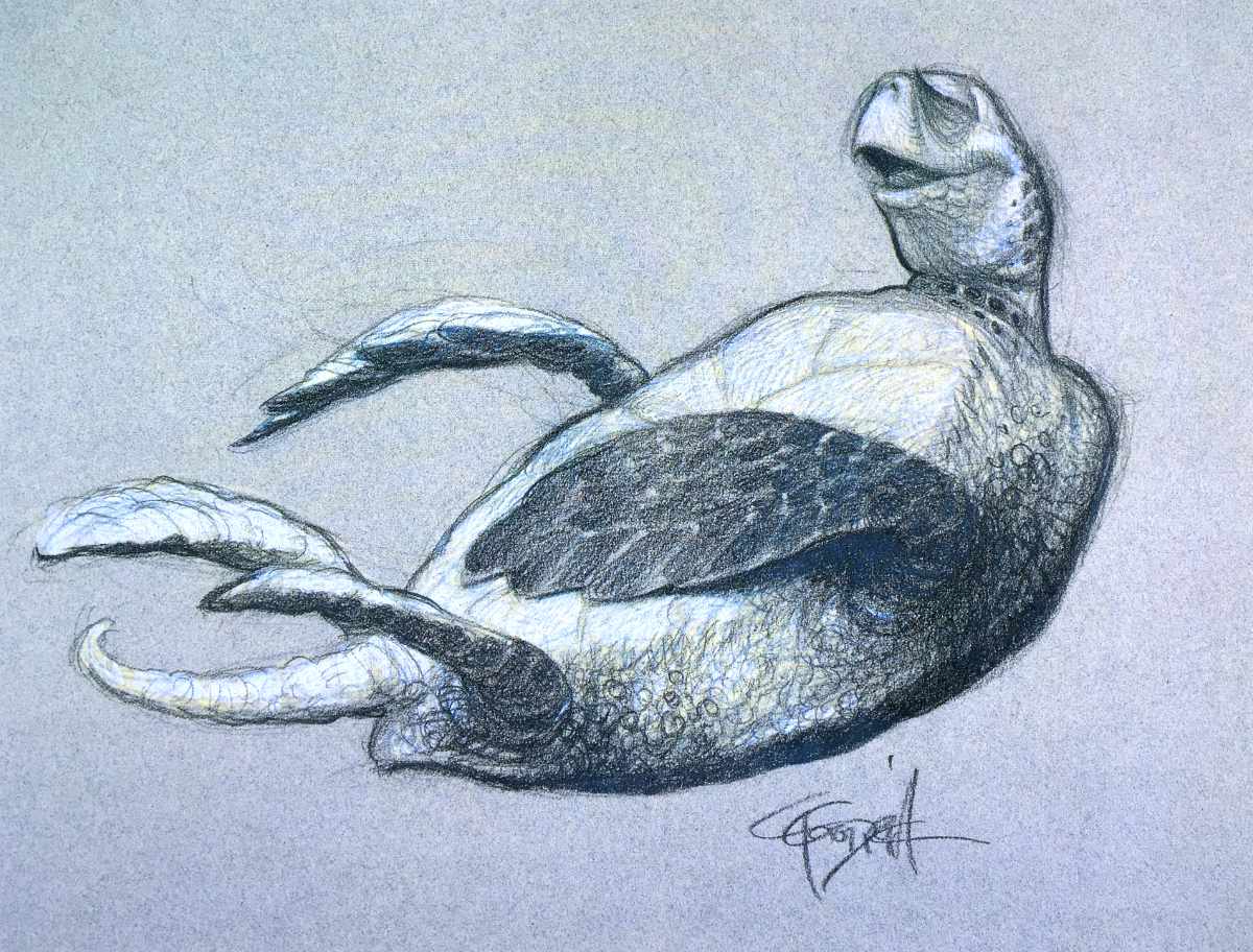
Page 86-89 showcase some fantastic pencil sketches, especially on page 86-87 which showcase some more of Carter Goodrich's work.
Many concept art fans will recognise Goodrich's work featured throughout most of the Pixar concept art books. They're almost always pencil drawings, sketchy, but lovely caricatures. The sense of character he conveys is fantastic.
Also, another favourite of mine in this chapter is the page of cute baby turtle marker sketches by Peter de Seve. Check them out on page 89 - so adorable!
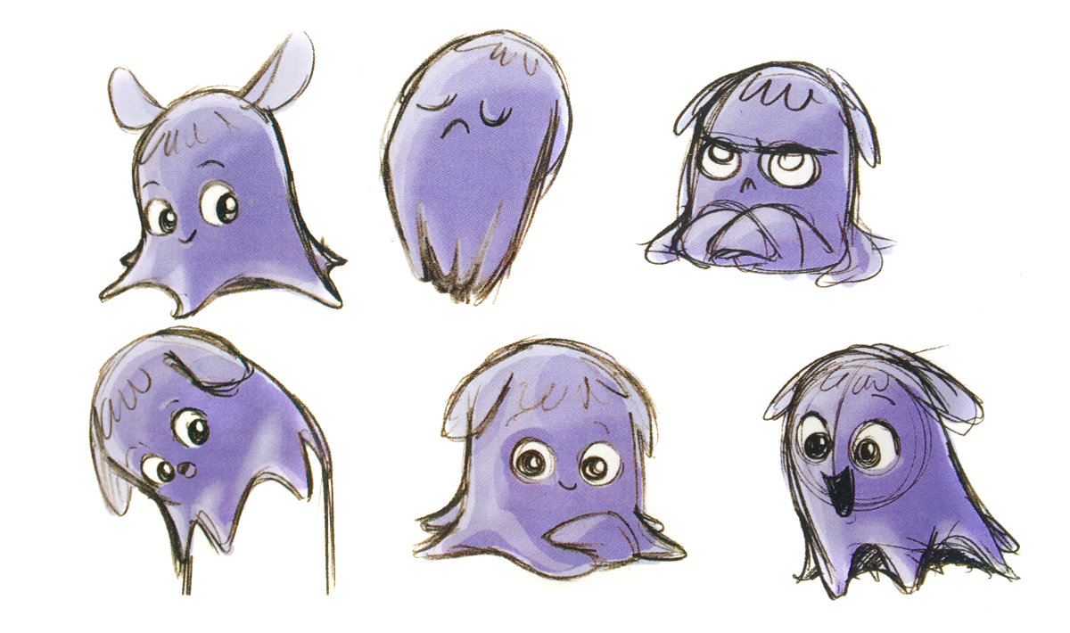
Chapter 3: The Tank and Harbor
This is the chapter I like the most because it features the most concentrated number of character design sketches. Understandably so as this is where Nemo meets an eclectic bunch of characters
There's Gill, the mysterious Clint-Eastwood-like leader of the tank, Deb the humbug fish, Bubbles, Gurgle, Jacques, Peach, Bloat the Blowfish and Nigel, the pelican from the Harbour.
With such an eclectic mix of characters to design, this section naturally features many more pencil sketches.
Ricky Nierva, character art director, says:
"The tank gang's characteristics were likened to the neuroses of the characters in One Flew Over the Cuckoo's Nest"
If you're a character design fan like me, you will probably enjoy this section the most.
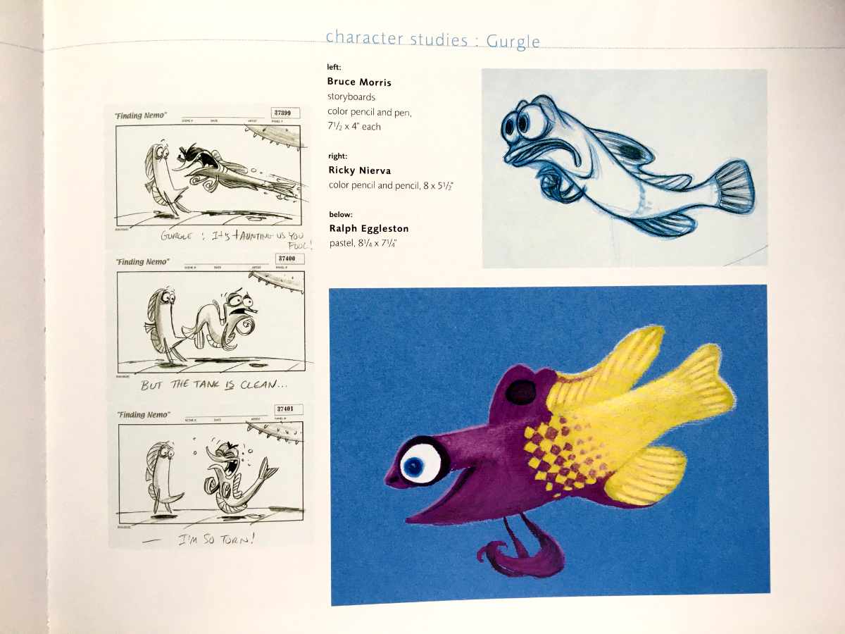
There is also a great selection of storyboards featuring the key poses from specific sequences. For example, on page 117 with the neurotic Gurgle key poses illustrating the captions beneath.
My favourite medium has always been pencil, and it's my favourite part of any concept art book. Especially pencil sketches drawn on top of the coloured pencil sketches (think Florian Satzinger).
So, it's no surprise that one of my favourite pieces in the Art of Finding Nemo is on page 136 - the pelicans sat on the pub. Jason Deamer is the artist and many more of his pencil sketches are dotted throughout the book, each one a delight!

Minor criticisms
If you're looking for beautiful and inspiring lighting studies or examples of pastel and charcoal mastery, this is the book for you.
However, if you're a character designer looking specifically for character design inspiration, there are probably other books I would recommend.
For example, The Tarzan Chronicles feature many more pencil sketches, especially by the amazing Glen Keane.
I would also recommend The Art of Monsters University, which with its vast cast of characters naturally features so many fantastic character designs.
Also, The Art of Finding Nemo doesn't feature any of the clay models used in pre-production, which feature in some later art books, like The Art of Ratatouille. This may disappoint if you're into 3D modelling.
A few reviewers online mentioned they would have liked to have seen comparisons between the production art and the final rendered scene. Which, again, may be a disappointment if you're a 3D modeller. Though being fair, this isn't really a feature of these types of concept art books.
Finally, the last few pages of concept art in the third chapter features the fishing boat scene, the ultimate climax of the film. The artwork here is very art deco in style.
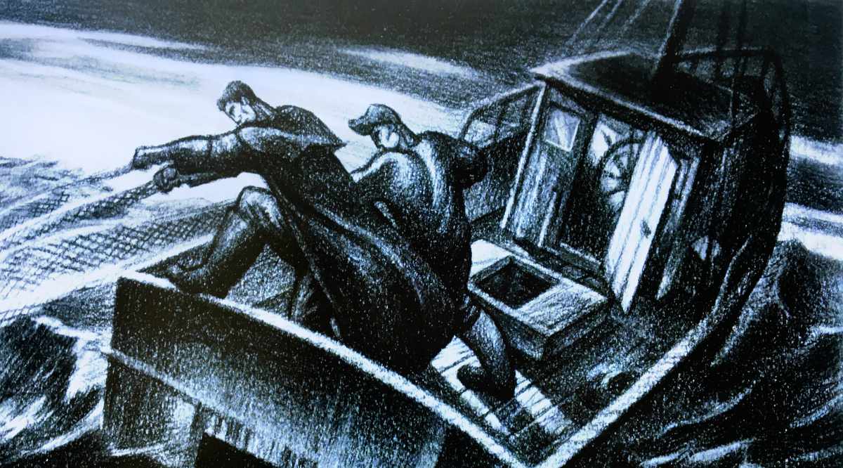
To be honest, I'm not sure how much of the ideas in these pieces of concept art made it into the film. However, if you're into Art Deco, you might like these pieces but I prefer the coloured pastel scenes found earlier in the book.
Final thoughts
The Art of Finding Nemo is a wonderful behind the scenes look at one of the most influential films of my life.
But to any fan of concept art, it's another sparkling window into the magnificent world of pre-production concept art. The concept art featured is exquisite, the artists themselves surely some of the greatest living masters in their field.
It's been a joy to review this book, filling me with much nostalgia for my formative years.
It's reminded me of my daring to turn away from a traditional career path in favour of a creative, much less certain one. But as story supervisor Ronnie del Carmen says in the book:
"...that's the theme of the movie. It asks: Are you going to live a life of complete safety and risk nothing? Or are you going to take a chance and maybe find that only by doing so are you truly alive?"


